Tuesday, 25 December 2012

ELEMENT OF GRAPHIC DESIGN

ELEMENT OF GRAPHIC DESIGN (Week 3)

  • Among this elements contained in the graphic designer is line, shape, type, color, texture and art, illustration and photography.

LINE


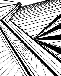
  • A narrow continuous mark, as one made by a pencil, pen, or brush across a surface and it used to produce a design, pattern, shadow and divide the space in a any our design. Between basic in the line - curved, straight, swirling.


SHAPES


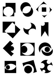
  • The shape of an object is a primary condition fundamental for our lives. Shape is the primary visual attribute among others (color, shade, lighting) that elicits unambiguous identification due mainly to its constancy. Another relevant perceptual property is its uniqueness. Indeed, it is unique and much more informative than any other object properties, i.e. color, shading (depth) and lighting (illumination). It's also to focus and give meaning to our design.


TYPE


  • A pattern, a design, or an image impressed or stamped onto the face of a coin. The original object, or class of objects, scene, face, or conception, which becomes the subject of a copy. It also to communicate effectively on your work and to interest  people when see your design.


TEXTURE


  • The word texture means what things are made of and how they feel. Textures can be described as “rough”, “smooth”, “hard”, “soft”, “liquid”, “solid”, “lumpy”, “gritty” etc. The word “texture” is used for many different things. It can even be used in abstract senses, e.g. for music and poetry. It also can be used to attract people to feel the texture and to see unique of your design. 


COLOUR


  • Color can influence our emotions, our actions and how we respond to various people, things and ideas. Much has been studied and written about color and its impact on our daily lives. It also give a sense of completion.


ART, PHOTO & ILLUSTRATION


  • Photo selection is very important. It's to tell the person  about the ideas, illustration, story and illustrations which one we use. Artwork that helps make something clear or attractive. It is also to attract the people to see our work.
Saturday, 22 December 2012

CORPORATE IDENTITY

WHAT IS CORPORATE IDENTITY?
  • In Corporate Communications, a corporate identity is the "a" of a corporation which is designed to accord with and facilitate the attainment of business objectives. It is usually visibly manifested by way of branding and the use of trademarks.
  • Corporate identity comes into being when there is a common ownership of an organizational philosophy that is manifest in a distinct corporate culture — the corporate personality. At its most profound, the public feel that they have ownership of the philosophy. Corporate identity helps organizations to answer questions like “who are we?” and “where are we going?” Corporate identity also allows consumers to denote their sense of belonging with particular human aggregates or groups.
  • In general, this amounts to a corporate title, logo (logotype and/or logogram), and supporting devices commonly assembled within a set of guidelines. These guidelines govern how the identity is applied and confirm approved colour palettes, typefaces, page layouts.
  • Similarly, a business makes itself distinct through the image that it presents to the world, through collateral like business cards, letterheads, brochures and other options. It is a physical expression of the company's brand, an extension of the culture that is already expressed through communication style and behaviour exhibited to maintain the image of the business.
EXAMPLE : 


THE CONCEPT 

Corporate identity is often viewed as being composed of three parts:

  • Corporate design (logos, uniformscorporate colours etc.)
  • Corporate communication (advertising, public relations, information, etc.)
  • Corporate behavior (internal values, norms, etc.)


CORPORATE COLOURS

Corporate colours, (or company colours), which are one of the most instantly recognizable elements of a corporate visual identity and promote a strong non-verbal message on the company's behalf.

Examples of corporate colours:
  • Red for Coca-Cola
  • Blue for IBM, nicknamed "Big Blue"
  • Brown for UPS, "What can Brown do for you"
  • Green for Petronas Petrol Station

    CORPORATE IDENTITY STRATEGY

    (Best Practices)The following four key brand requirements are critical for a successful corporate identity strategy.

    FOR EXAMPLES :
    • Differentiation. In today’s highly competitive market, brands need to have a clear differentiation or reason for being. What they represent needs to be stand apart from others in order to be noticed, make an impression, and to ultimately be preferred.
    • Relevance. Brands need to connect to what people care about out in the world. To build demand, they need understand and fulfill the needs and aspirations of their intended audiences.
    • Coherence. To assure credibility with their audiences, brands must be coherent in what they say and do. All the messages, all the marketing communications, all the brand experiences, and all of the product delivery need to hang together and add up to something meaningful.
    • Esteem. A brand that is differentiated, relevant and coherent is one that valued by both its internal and external audiences. Esteem is the reputation a brand has earned by executing clearly on both its promised and delivered experience.

    LOGO DESIGN PROCESS

    RESEARCH

    • Competitors :


    REFERENCE :


    SKETCHING AND CONCEPTUALIZING :


    EXPERIMENT WITH LOGOTYPE :


    EXPERIMENT WITH COLORS :


    EXPERIMENT WITH SIZE :


    FINAL LOGO :


    LOGO RATIONALES :


    STATIONARIES :


    ROLE OF A GRAPHIC DESIGN

    LOGO


    • A name, or trademark designed for easy and definite recognition, especially one borne on a single printing plate or piece of type. A logo is a graphic mark or emblem commonly uses by commercial enterprise, organisations and even individuals to aid and promote instant public recognition.


    SYMBOLS / ICON


    SYMBOL :
    • A symbol is something that represents an idea, a physical entity or a process but is distinct from it. Something that represents something else by association, resemblance, or convention, especially a material object that used to represents something invisible. A printed or written signed used to represents an operation, element, quantity, quality, or relation, as in mathematics and music.


    ICON :
    • An icon is a graphic image, a small pictures or object that represents a file, program, webpage, or command. (Computer Science) a graphic symbol (usually a simple picture) that denotes a program or a command or a data file or a concept in a graphical user interface.


    WEBSITE


    • Content such as text, images, video, audio, etc. A website refers to how its massages, text,image and other information are displayed on the web page. for example, news articles for today , book and music CD/DVD. It is for people promote their own business. 

    CORPORATE STATIONERY


    ENVELOPE


    CALL CARD


    LETTERHEAD


    NOTEPADS

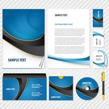
    • Corporate stationery refers to paper products used by a business or corporation, including letterhead, envelopes, business cards, notepads, brochures, and thank-you cards. It can serve as a valuable public relations tool, as well as helping to define the image and standards of the business. Choosing the best corporate stationery will depend on the goals and needs of an individual company, but some factors to consider include design, types and amounts of stationery required, security features, and ease of re-ordering.

    GREETING CARDS


    • A greeting card is an illustrated, folded card featuring an expression of friendship or other sentiment. Although greeting cards are usually given on special occasions such as birthdays, Christmas or other holidays, they are also sent to convey thanks or express other feeling. Greeting cards, usually packaged with an envelope, come in a variety of styles. There are both mass-produced as well as handmade versions that are distributed by hundreds of companies large and small. 


    ADVERTISEMENT


    • Advertising is mass media content intended to persuade audiences of readers, viewers or listeners to take action on products, services and ideas. It also can take some new action to buy the products produced from your company.


    BOOK DESIGN


    • Book design is the art of incorporating the content, styleformatdesign, and sequence of the various components of a book into a coherent whole. To produce perfect books must be produced in accordance with of the book's content in order to attract customers to buy.

    BROCHURES


    • Publication consisting of one folded page, or several pages stitched together but not bound. Used mainly for advertising purposes. The brochure is one of the best ways to present your company. There are tri-fold brochures used to advertise a new product or service that your company offers, or there are bi-fold folders that are used to present your company projects outside or inside it. There are different brochure types, and every type has a different way to be designed. The criterion adopted to design a bi-fold brochure to present your company projects for internal use would be different from the one for external use.


    BILLBOARDS


    • Billboards take two forms. The most common definition of a billboard is an outdoor sign or poster you usually see on freeways, highways and streets. A billboard is also an announcement of a sponsor or sponsors at the beginning, middle or end of a radio or television broadcast.
      Also Known As : A billboard that is an outdoor sign or poster is also known as outdoor advertising.

    PRODUCT PACKAGING


    • Packaging is the science, art and technology of enclosing or protecting products for distribution, storage, sale, and use. It is the process of enclosing, or containing the product in bottles, plastic bags, wrappers, lubes, paper cartoons and boxes etc. For the purpose of displaying useful information regarding the product, its contents, weight, size, price, constituents, usage necessary instruction about the usage and storing the product must be recorded on the package. Package reduces the risk of wastage, spoilage, leakage, metage and evaporation etc. in the process of transportation and storage.

    POSTERS


    • poster is any piece of printed paper designed to be attached to a wall or vertical surface. Typically posters include both textual and graphic elements, although a poster may be either wholly graphical or wholly text. Posters are designed to be both eye-catching and informative. Posters may be used for many purposes. They are a frequent tool of advertisers (particularly of events, musicians and films), propagandistsprotestors and other groups trying to communicate a message. Posters are also used for reproductions of artwork, particularly famous works, and are generally low-cost compared to original artwork.